

Nothing OS 3.0 was made available to us for thorough inspection earlier this week. As anticipated, it had a number of new functionality and UI modifications that are uncommon in software releases. However, during my hands-on experience with the operating system, a few functions fell short of my expectations and left some room for improvement. That’s why, before Nothing OS 3.0 is formally released, I made this list of all the small adjustments I would like to see.
New Location for the Pinned App
Generally, you may enable app suggestions in the app drawer, which lists your most often used or well-liked apps at the top. However, these recommendations hardly ever work. Instead, Nothing has introduced a straightforward yet clever hack that lets you manually pin your preferred applications to the top of the page. I gushed about this feature in my Nothing OS 3.0 hands-on impressions because I really loved it.
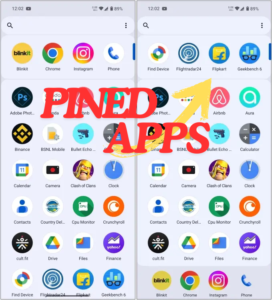
After talking to a few friends, though, I came to the conclusion that if I were pinning my apps, it wouldn’t hurt to always be able to access them when browsing the drawer. The pinned apps ought to, in my opinion, be sticky and visible at the bottom of the carousel. Really, if those are the apps I want to use first, shouldn’t they always be visible? Thus, this is my initial recommendation for enhancing the app drawer.
Slider for Brightness in Collapsed View
With Nothing OS 3.0, the entire quick settings panel was redesigned, including the thicker brightness slider that was shifted to the bottom of the panel. I can now reach the slider with one hand and avoid reaching up with my finger, so this is a nice location for it.
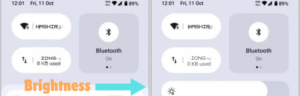
To access the brightness slider, you must swipe down twice from the top of the fast settings in order to fully expand them. Something like this ought to be accessible with just a single swipe. Consequently, nothing should enable the brightness slider to be used from the folded panel, improving user accessibility.
Modify the Widget and Clock Face Colors
The latest update also includes lockscreen customizations, which let you change the face of the clock or add extra widgets. And I already think these new clock designs are great. However, why must everything be so clear-cut? I occasionally change my wallpaper, and although I find monochrome to be charming, I also enjoy the occasional pop of color.
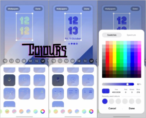
A custom color picker would be a fantastic addition to Samsung’s One UI, which already allows you to choose the color of the lockscreen clock face and notifications. These new clock face designs are really distinctive; altering their hue would make them stand out more against the background.
I’m not asking for much; just let’s swap out the colors of all the black-and-white components on the lock screen, such as the widget elements and clock faces.
Modifications to Smart Drawer
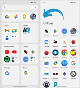
Another new feature is Smart Drawer, which automatically arranges all of your apps into various category folders. If you’ve used iOS, you are aware of how similar this feature is to the App Library. I’m among those who find this function useful, however its lack of customisation prevents me from making it my default.
I am unable to reorganize these folders, thus whatever is at the top remains there. I am not able to make new folders or move programs from one folder to another. I am now unable to do anything about the fact that my two email applications are in different folders. For this reason, I would ask Nothing’s staff to allow for some customisation of this new “Smart” app drawer.
Permit Users to Select the Font
Not to be overlooked is the issue with the N-dot font. The London-based IT startup eliminated its trademark font from the user interface with Nothing OS 3.0. I understand that this is due to improved readability. Without a doubt, the new Sans Serif typeface is better than the previous one.
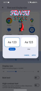
On the official community page and Reddit, several fans have stated that they miss the dotted typeface, nevertheless. What if there was a way to switch between the old and new fonts? Everyone will be satisfied if they have the choice to switch between the two. Why not provide a feature similar to this for all of the N-dot enthusiasts out there? There is already a setting to alter the default typefaces.
Stacks of widgets
Widget stacks are another aspect of Samsung’s One UI that I really like and would love to see brought over to Nothing OS. The widgets in Nothing OS are one of its best features, and a new hourglass widget will be available soon.
And no matter how much I would like it, I can’t have just widgets covering my entire homescreen. Then, how about a feature that lets me arrange widgets on top of each other so that I can see information quickly and have room for more widgets and necessary apps? I’m confident that this feature will work really well with Nothing devices.
Thus, these are all the small adjustments I’m hoping to see in the forthcoming software version of Nothing. While some of these modifications are my own ideas, others are suggestions from my editors and ideas from discussion boards in the community.
Please share your thoughts with us regarding this list and let us know if there are any features you would want to see included in Nothing OS 3.0 but we overlooked.
1 thought on “Six Little Changes That Could Further Enhance Nothing OS 3.0”